
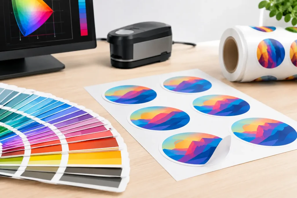
A wall graphic can be perfectly designed and still disappoint on site if the printed colour is wrong. Brand reds shift towards orange, photographic shadows close up, skin tones turn dull, or a deep corporate black appears washed out. ICC profiles are the practical link between artwork, ink, printer and printable media that helps prevent those costly surprises.
For professional print providers, this is not simply a colour-management exercise. It is about producing a finish that looks right under venue lighting, installs with confidence and delivers the result the client approved. When graphics need to be changed, repositioned or removed cleanly, there should be no time lost reprinting material because the first output did not match expectations.
What ICC profiles do
An ICC profile is a data file that describes how a specific printer, ink set and media combination reproduces colour. It tells the RIP or print workflow how to translate the colour values in a design file into the amounts of ink needed to achieve the intended visual result on that material.
Without the right profile, a printer still produces an image, but it is effectively working from assumptions. Those assumptions may be close enough for an internal poster or a quick proof, yet they are rarely good enough for a retail rollout, a museum display, a branded exhibition stand or a high-value interior scheme.
A profile accounts for the character of the media. A woven self-adhesive polyester fabric does not receive and reflect ink in the same way as gloss vinyl, coated paper or canvas. Its texture, whiteness, coating and opacity all affect perceived colour, detail and density. Good profiling recognises that difference rather than trying to force every substrate through one generic setting.
Why profile choice matters on fabric wall graphics
Peel-and-stick fabric media is selected for its practical advantages: clean, residue-free removal, repeated repositioning, surface protection and a more refined finish than many conventional PVC options. Print quality must support those benefits. A beautiful fabric texture can lose its impact if fine detail fills in or colours do not hold their intended balance.
The correct ICC profile helps control several outcomes at once. It supports accurate colour, sensible ink limits, smoother tonal transitions and sharper detail. It can also reduce the risk of over-inking, which may slow drying, soften fine text, create excessive ink build-up or affect handling during finishing and installation.
That does not mean one profile will suit every job. The best choice depends on the printer platform, ink chemistry, RIP, resolution, pass count and media variant. A profile made for UV ink cannot be assumed to perform correctly with latex, eco-solvent or resin ink. Likewise, a setting that looks strong on an opaque blockout material may not be the best route for a translucent fabric application.
Start with the complete print system
Treat a profile as part of a complete production specification, not as a file to load and forget. Before selecting one, confirm the exact printer model, ink set, RIP software and Phototex product being printed. Identify whether the job calls for Original, OPAQUE or EX, because each is designed to solve a different application challenge.
Phototex Original is suited to a wide range of wall graphics and decorative applications where the fabric character and easy repositioning are central to the project. OPAQUE provides stronger coverage and helps create invisible overlaps, making it particularly useful where wall colour, previous graphics or panel joins could affect the finished appearance. EX is engineered for demanding surfaces, including textured walls and floor applications, where higher adhesive strength is required.
The print profile must match that choice. If a project is quoted using one media but printed on another, a colour-approved proof may no longer be representative. This is especially relevant where a client expects a specific brand colour to repeat across window graphics, wall panels, display elements and temporary event surfaces.
Keep application conditions in view
Colour is assessed by people, not instruments alone. The same printed blue can appear different under cool gallery lighting, warm hospitality lighting or bright retail LEDs. Where colour is business-critical, evaluate a test print in the intended environment or under a controlled viewing light that reflects it closely.
Wall colour also matters, particularly with translucent or lighter-weight applications. A pale graphic installed over a dark painted surface can appear different from the same print viewed on a white bench. OPAQUE can remove much of that substrate influence, but it remains good practice to test the real combination before committing to production.
A practical ICC profile workflow
The most reliable workflow is straightforward, but it needs discipline. Begin by checking that the printer is mechanically sound: no blocked nozzles, inconsistent firing, contaminated media path or ageing maintenance parts. No ICC profile can correct a printer that is physically printing unpredictably.
Then install the recommended profile in the RIP and select the associated media preset. The preset commonly includes more than colour data. It may specify ink limits, resolution, heater settings, pass count, vacuum settings and print direction. Changing these settings substantially after profiling can alter the result, so avoid treating them as unrelated production preferences.
Print a controlled test file containing brand colours, neutral greys, gradients, flesh tones, dense blacks, small text and photographic detail. Allow it to dry and stabilise before judging it. Fast turnaround matters, but assessing a print too early can lead to decisions based on a temporary appearance rather than the finished result.
Check the print at normal viewing distance as well as close up. A slight texture is part of fabric media’s character; a muddy image, broken type or visible banding is not. If the job will be installed in panels, test a joined section too. Colour can be technically correct while a panel sequence reveals differences caused by feed direction, curing or inconsistent production settings.
For repeated campaigns, record the setup used: media product, batch where relevant, printer, ink, RIP version, profile name, preset and environmental conditions. This takes minutes and can save hours when a retail team asks for a second run six months later that must sit beside the first.
Common colour-management mistakes
The first common mistake is allowing more than one part of the workflow to manage colour. For example, colour correction may be active in both design software and the RIP, resulting in an unwanted colour shift. Choose a defined workflow and make sure everyone understands where the conversion takes place.
The second is using a generic profile because it is already available. Generic settings may offer an acceptable starting point, but they are not a substitute for a profile built for the actual printer, ink and media combination. The cost of a small test is usually far lower than the cost of reprinting and reinstalling a full wall.
The third is judging a print only from a monitor. Screens are emissive, bright and variable. Printed fabric is reflective and affected by surrounding surfaces and light. Calibrated monitors are useful, but physical proofs remain the sensible decision point for colour-sensitive work.
A fourth mistake is pushing saturation beyond what the media and ink combination can reproduce cleanly. More ink does not automatically mean more impact. It can reduce shadow detail, compromise drying and create an unnaturally heavy finish. Strong colour should look intentional, not overloaded.
When a custom profile is worth it
Recommended profiles are the right starting point for most everyday production. A custom profile becomes worthwhile when work is colour-critical, volume is high, a specific printer configuration is unusual, or a business needs tight repeatability across multiple jobs and sites.
Consider it for national retail campaigns, branded interiors, photographic exhibitions, heritage interpretation and any project where a client has approved physical colour standards. A custom profile can be built around the precise print conditions used by your operation, rather than an average configuration.
There is a trade-off. Profiling takes time, requires measurement equipment and needs reviewing whenever significant variables change, such as ink, printer condition, RIP version or media specification. For short, low-risk jobs, a properly tested supplied profile may be the more commercially sensible route. For repeat, premium work, the investment can reduce waste and protect margins.
Colour consistency supports a better installation
Accurate print is part of installation efficiency. When panels match, artwork aligns visually and brand colours hold across a space, installers can focus on placement rather than explaining variation to a client. That matters in live retail environments, exhibition build-ups and venue changeovers where access windows are short.
It also supports the broader value of removable fabric graphics. A campaign can be installed, peeled away cleanly and replaced without the wall repairs, residue removal and disruption often associated with conventional adhesive materials. Reusable, repositionable graphics are only truly efficient when the print result is dependable from the first panel to the last.
Before committing to the full run, print the file, view it in the real setting and approve what will actually go on the wall. That small production check keeps colour credible, protects the surface and gives every finished graphic the confidence to stick it, peel it, remove it and reposition it.
 English
 French